BRANDING
BRANDING
BRANDING
■ FAMILY ¦ DENTISTRY
■ FAMILY ¦ DENTISTRY
■ KFD ¦
GONZALO BUSTAMANTE
GONZALO BUSTAMANTE
GONZALO BUSTAMANTE
GUNZ
YEAR ¦ 2019 ■
YEAR ¦ 2019 ■
YEAR ¦ 2019 ■

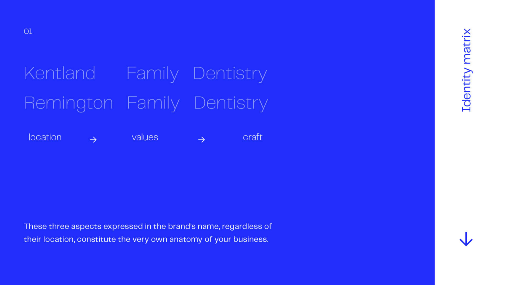
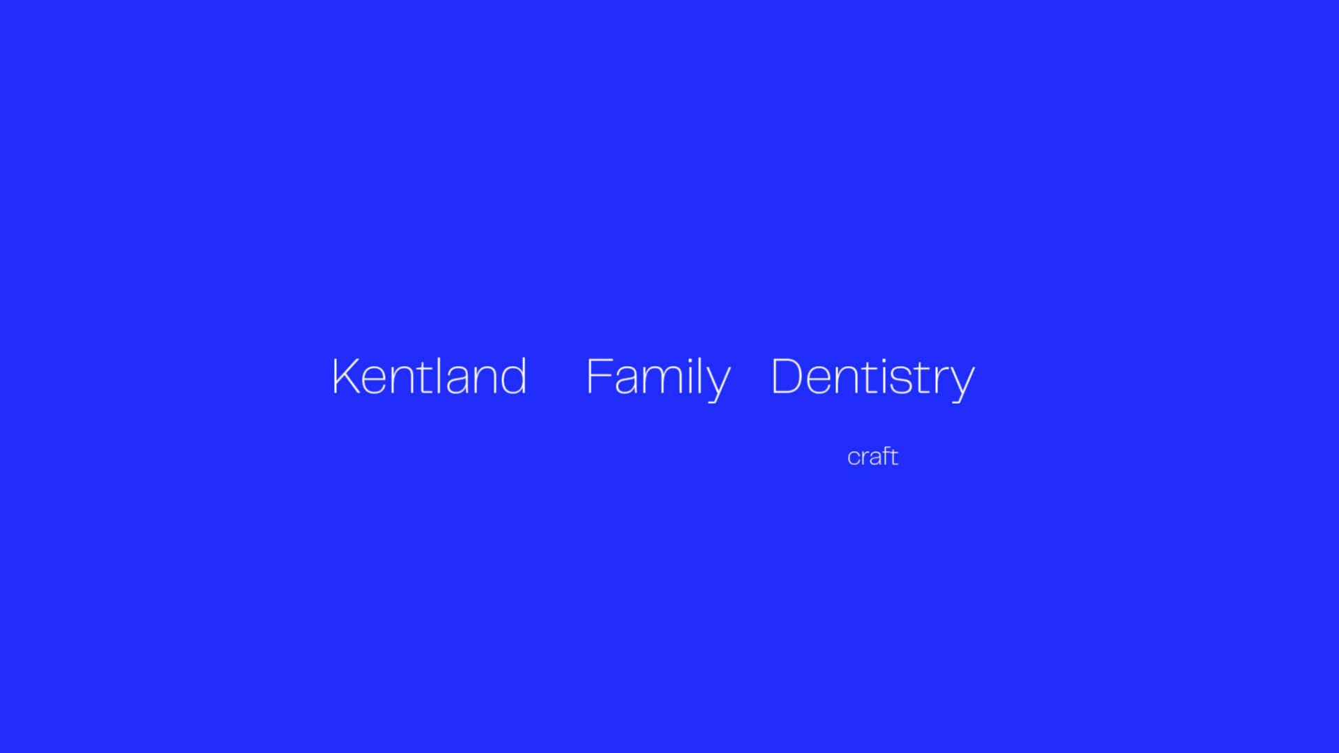
Kentland Family Dentistry
A forty-one-year-old rural full-service dental office providing family, restorative and cosmetic dentistry that wanted to increase new patient volume but had never invested in marketing.
Branding Strategy
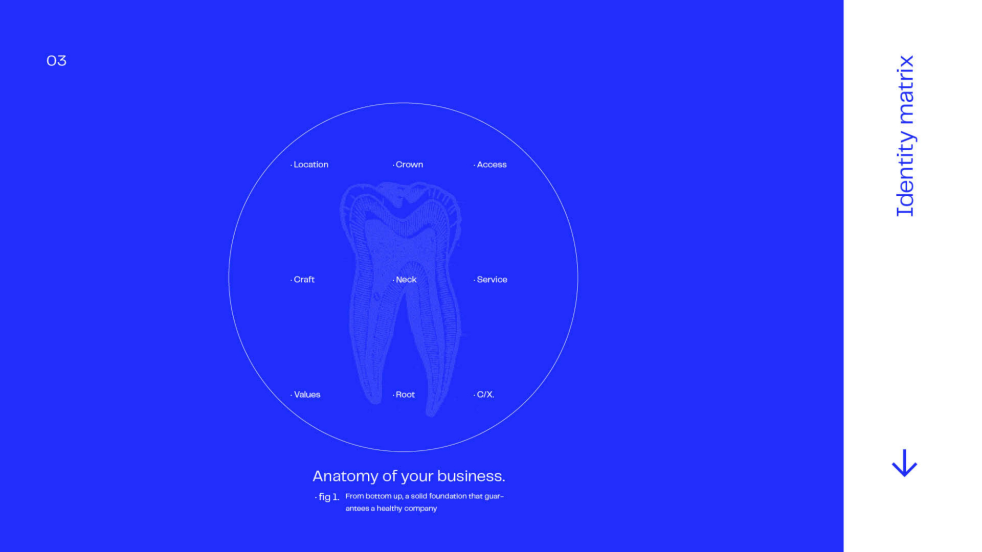
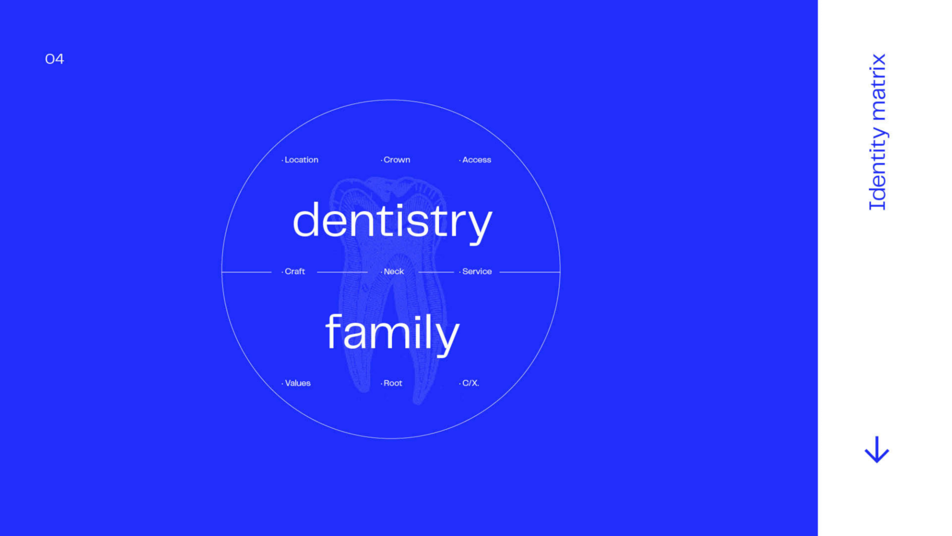
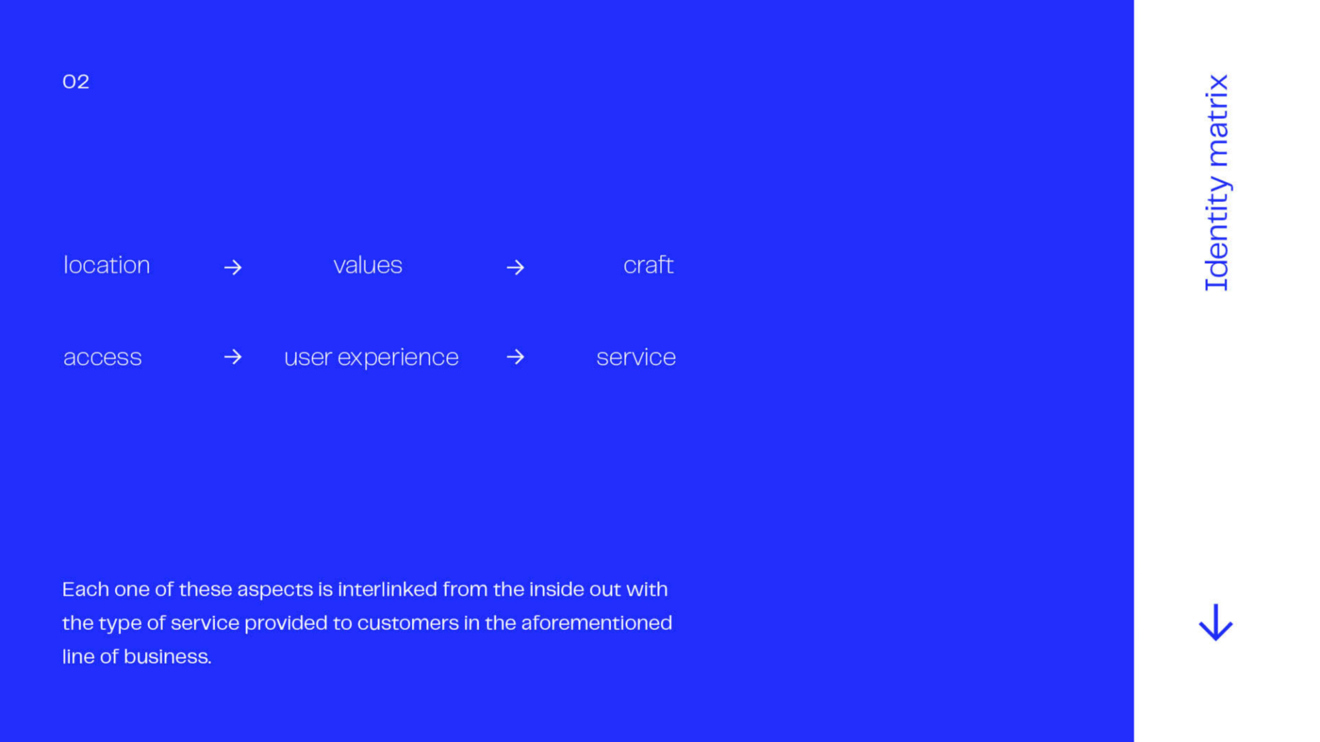
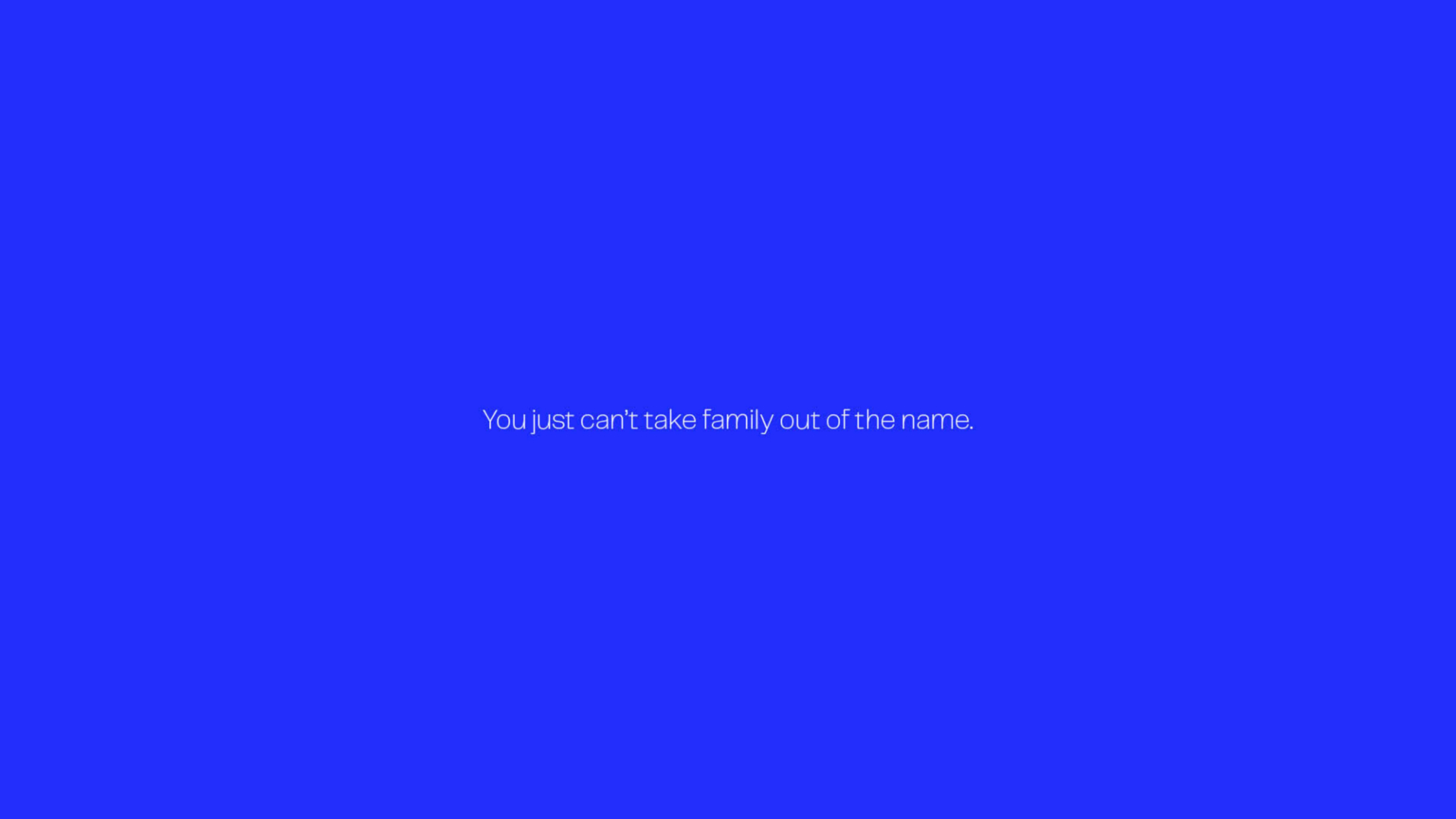
Kentland Family Dentistry is located in a rural town in Indiana surrounded by twenty other “family” dental practices. While, they all look alike and possess the same technologies and offer the same services, crowns, extractions, invisalign, and so forth, we knew that we had to define what made this family dentistry special, especially under the new covid 19 paradigm and the complexities it brings to health care.
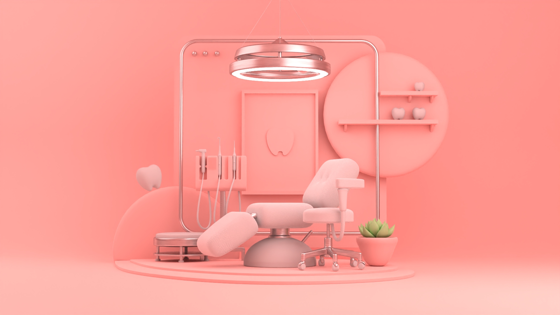
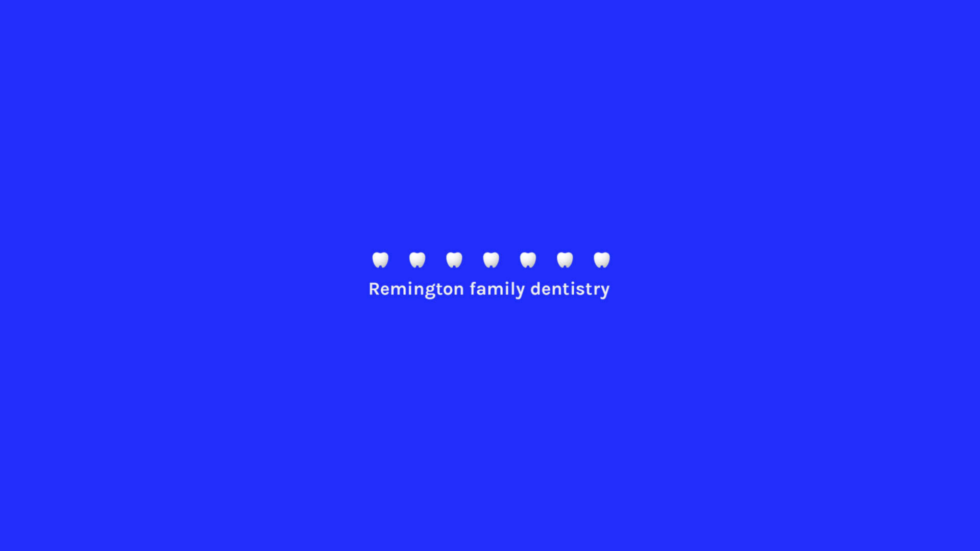
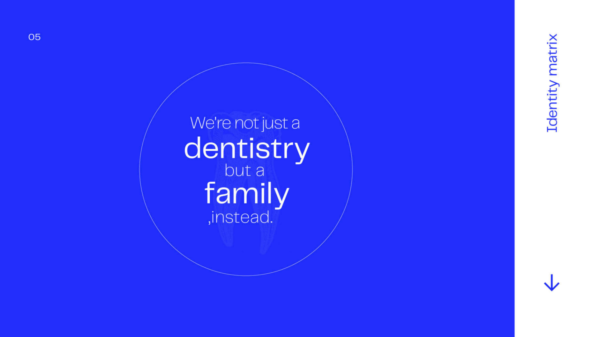
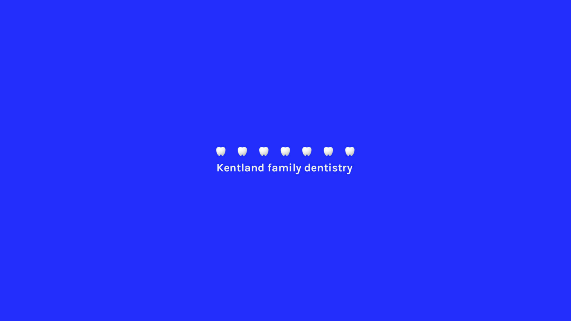
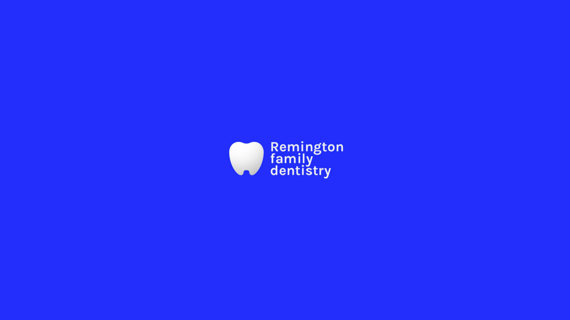
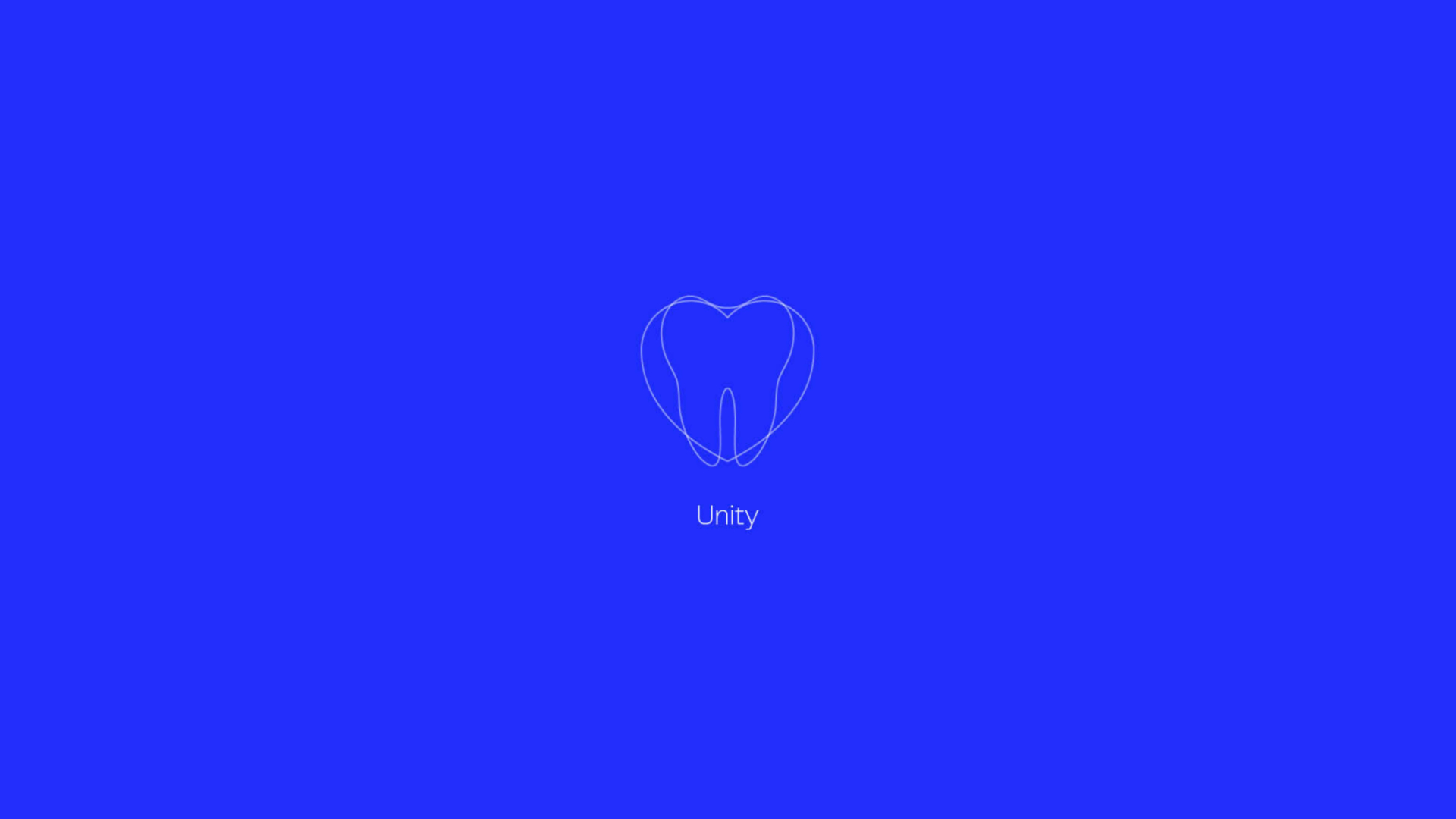
Our Logo
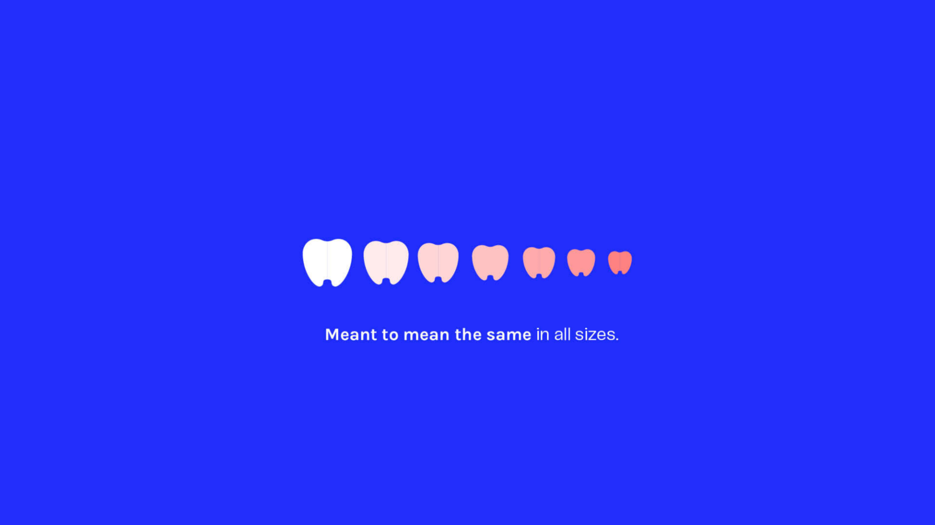
Our evolved family dentistry logo - a symbol of simplicity, professionalism and love for what we do-is the cornerstone of our business. A simplified but elegant way to present and differentiate ourselves, not only from our competitors in the super populated realm of family dentists but as a unifying tool to establish a solid bridge between our service and our customers. Our branding makes Kentland Family Dentistry “The” family dentistry first in line in the minds of Indiana’s dental patients.


Typography
Typography
We picked a mid-century grotesk called Telegraf that enhances big sizes to distinguish the brand among other modern sans serifs in rural areas in the midwest, where leftovers of old signage and weathered billboards from the 70's and 80's can still be found scattered all over route 65. Something familiar but with a twist, for an audience that relates 'tradition' to quality.
For more information feel free to visit PangramPangram's foundry website here.
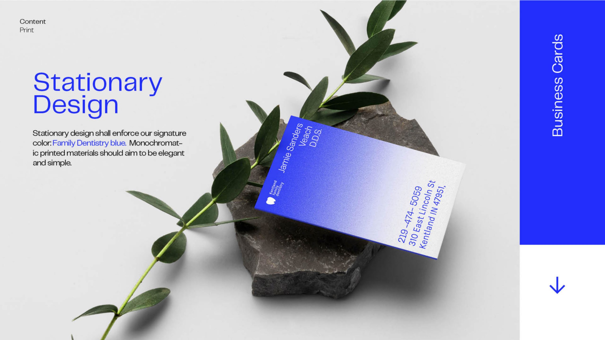
Brand Guidelines
We spent a considerable amount of time developing a “how to” guide for our branding, and training the team in programs like figma to master the specifications of logo use, the necessary fonts, primary and auxiliary colors, and more in order to guarantee the brand would accomplish its number one goal even after we finished the project: be distinct and memorable.
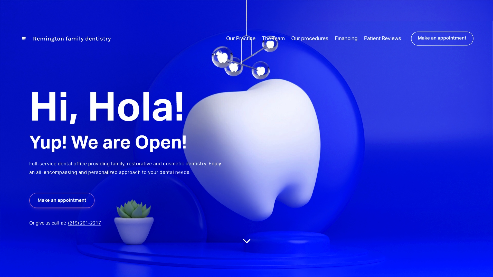
Website
Before our arrival, the company used a third party website service for dental offices with little to no customization whatsoever. There was simply no way to implement any sort of branding, original content or even change a broken link without calling customer service and waiting on hold for 30 minutes. 90's Madness! We conducted persona mapping techniques and card sorting exercises with patients that allowed us to rearrange information and construct a default but simple navigation for a new website mounted on squarespace. Responsive and customizable for their team to update whenever necessary.
FULL CREDITS
Art Director and Designer
Gonzalo Bustamante
Project Manager
Rachel Rosenberger
Client
Kentland / Remington Family Dentistry LLC
Year
2020