
Service Design
Service Design
A forty-one-year-old rural full-service dental office providing family, restorative and cosmetic dentistry that wanted to increase new patient volume but had never invested in marketing.
A forty-one-year-old rural full-service dental office providing family, restorative and cosmetic dentistry that wanted to increase new patient volume but had never invested in marketing.
Challenge
Challenge
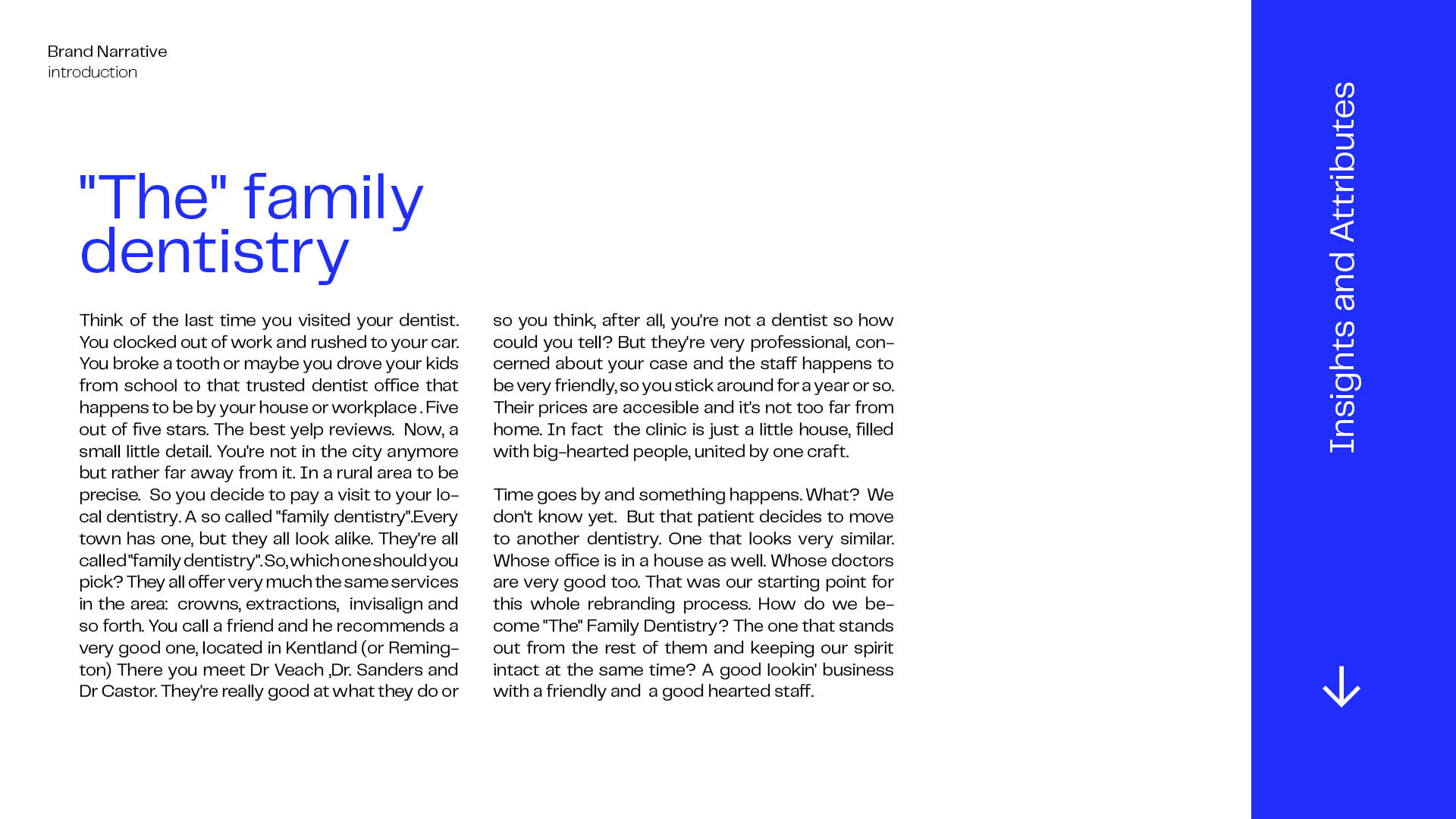
In rural Indiana, Kentland Family Dentistry had provided full service care for over forty years but had never invested in marketing. Surrounded by similar competitors, we knew it needed more than a new logo. As Lead Service Designer, I led a full rebrand and digital transformation to unify two entities and help the practice stand out in a post COVID landscape.
In rural Indiana, Kentland Family Dentistry had provided full service care for over forty years but had never invested in marketing. Surrounded by similar competitors, we knew it needed more than a new logo. As Lead Service Designer, I led a full rebrand and digital transformation to unify two entities and help the practice stand out in a post COVID landscape.
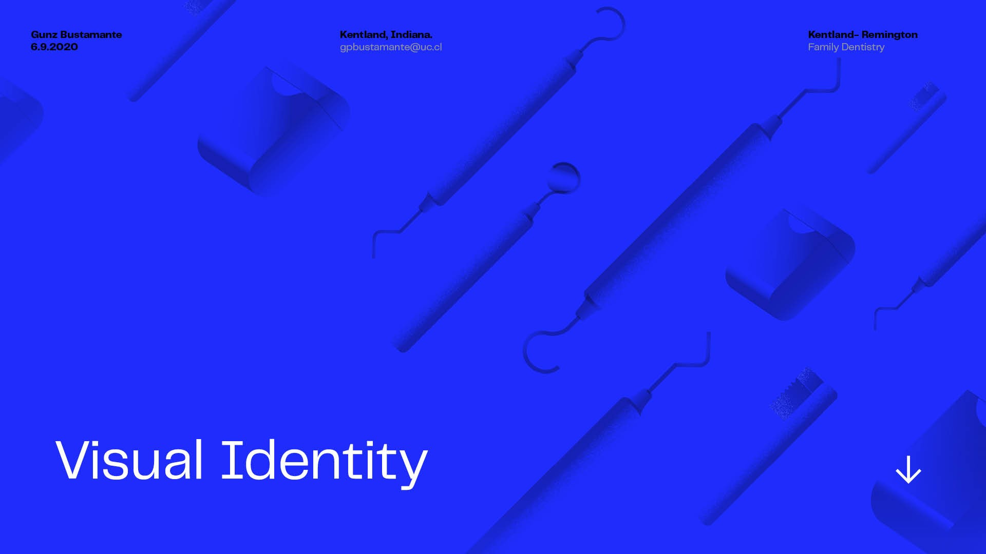
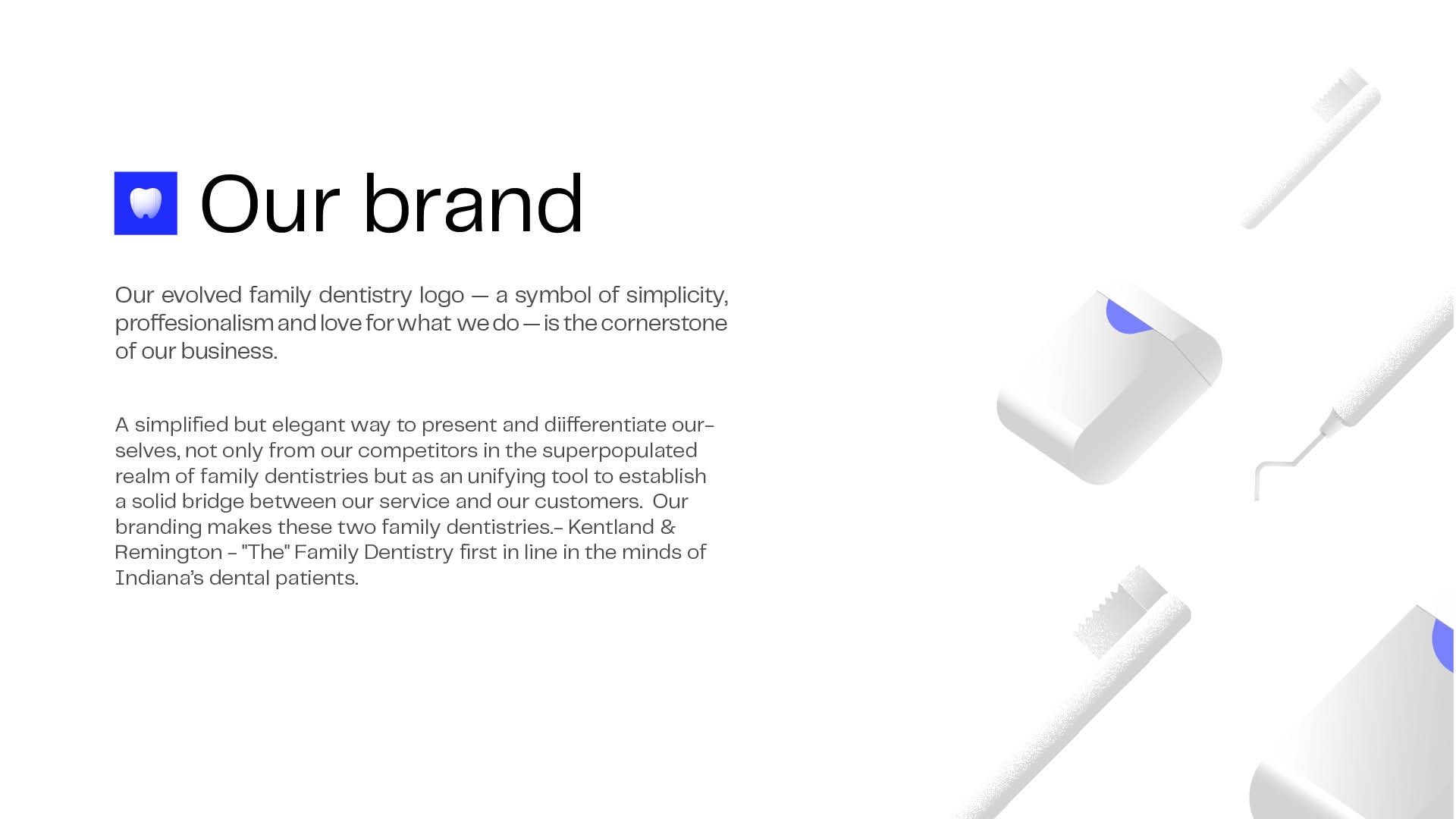
Brand Identity
Brand Identity
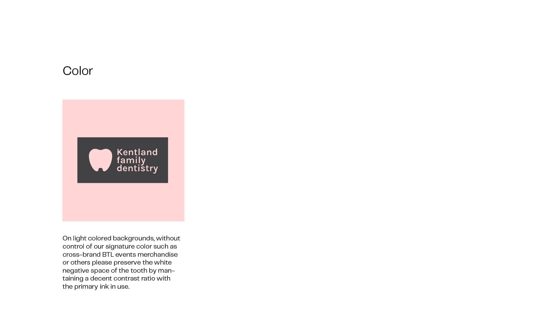
We created a brand identity centered on a logo that signals family, love, simplicity, professionalism, and care, making Kentland stand out in a crowded market of dentistries.
We created a brand identity centered on a logo that signals family, love, simplicity, professionalism, and care, making Kentland stand out in a crowded market of dentistries.
Typeface
Typeface
We paired our imagery with a mid-century grotesk called Telegraf that enhances big sizes to distinguish the brand among other modern sans serifs in rural areas in the midwest, where leftovers of old signage and weathered billboards from the 70's and 80's can still be found scattered all over route 65. Something familiar but with a twist, for an audience that relates 'tradition' to quality.
We paired our imagery with a mid-century grotesk called Telegraf that enhances big sizes to distinguish the brand among other modern sans serifs in rural areas in the midwest, where leftovers of old signage and weathered billboards from the 70's and 80's can still be found scattered all over route 65. Something familiar but with a twist, for an audience that relates 'tradition' to quality.


Digital Experience
Digital Experience
The clinic relied on a rigid website with no customization or control. We mapped patient journeys and restructured the experience around their needs. I delivered brand guidelines and trained the team to manage content and maintain consistency across touchpoints.
The clinic relied on a rigid website with no customization or control. We mapped patient journeys and restructured the experience around their needs. I delivered brand guidelines and trained the team to manage content and maintain consistency across touchpoints.
This holistic refresh led to a 50% increase in patient growth and a 20% boost in retention. Digital and out-of-home campaigns in both English and Spanish drove a 147% increase in Facebook reach and over $34K in new patient revenue. In just one month, our CX optimizations yielded 43 direct calls and a 71% uptick in user engagement.
For the feature launch, I led a team of creative technologists and VFX artists to develop efficient virtual production workflows and cinematic-quality pipelines.
All creative was produced fully in-house over two quarters, where we developed creative guidelines, documentation, game-like digital-twin assets, previs, a mocap library, and pre-shoot lighting style guides to align all areas of production.

Credits
Lead Service Designer & Art Director:
Gonzalo Bustamante
Project Manager: Rachel Rosenberger
Client: Kentland / Remington Family Dentistry LLC
Credits
Lead Service Designer & Art Director:
Gonzalo Bustamante
Project Manager: Rachel Rosenberger
Client: Kentland / Remington Family Dentistry LLC
©2025 GONZALO BUSTAMANTE
Go Back To Top
©2025 GONZALO BUSTAMANTE
Go Back To Top